Page layout
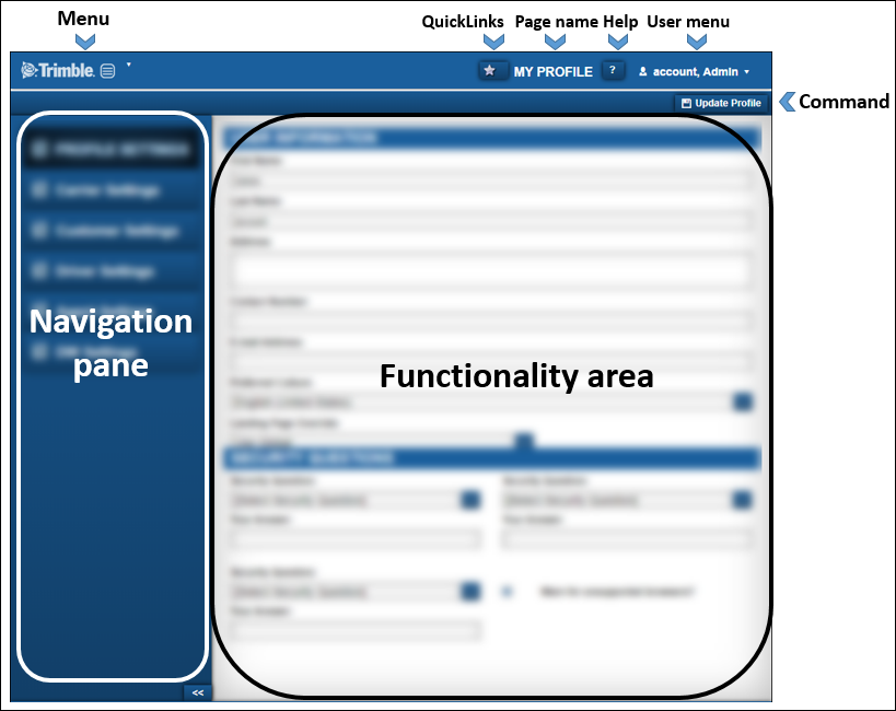
Pages are designed so that menus and functionality areas appear the same way throughout the application. While some elements are not part of every page, the basic layout of the page is consistent.
This design standard makes it easier for you to find what you need, no matter where you are on the website.

Menu
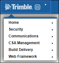
The main menu appears in the upper left of each page.

It consists of the core menus that are the starting point for accessing most of the website's features. This menu is referred to as Menu throughout the help system.
Quick Links star
You can use the Quick Links star to add any page you currently are viewing to your Quick Links. If the star is yellow, it is already one of your Quick Links.

Page name
The page name informs you of your location on the website. Page names are used throughout the help system to help you verify that you are in the correct place.

Help
To access information on using ClientCenter, click the Help icon. The online help includes how-to and reference information. It also includes videos designed to assist you with using the application.

User menu
Your user menu provides access to items related to your particular user account. From your user account, you can:
Access your My Profile page
Change your password
Access the online help system
Go to your Landing page
View your list of Quick Links
Logout
Navigation pane
The Navigation pane lists what tabs, if any, are available for the page you are viewing.
This illustration is an example of a page that shows multiple tabs in the Navigation pane. Click a tab to make its contents available in the functionality area of the page.
To create more room for the functionality area of a page, you can collapse the navigation pane using the  button at the bottom of the pane.
 button at the bottom of the pane.
Functionality area
The functionality area is the main body of the page where the feature or function that you are using appears. Some pages contain multiple functionality sections.
Refer to the individual feature or function help topics for detailed information about specific sections.