Working with a commodity’s forecast charts
Commodity forecasts provide the information the system needs to determine when a store needs product, and how much product should be delivered on individual orders.
For each store, you create a commodity forecast for each commodity you want to monitor.
A commodity forecast includes the tank information you recorded in the Company Tank Setup window’s Tanks tab, the estimated weekly sales volume for the commodity, and the number of weeks' worth of readings on which the forecast is based.
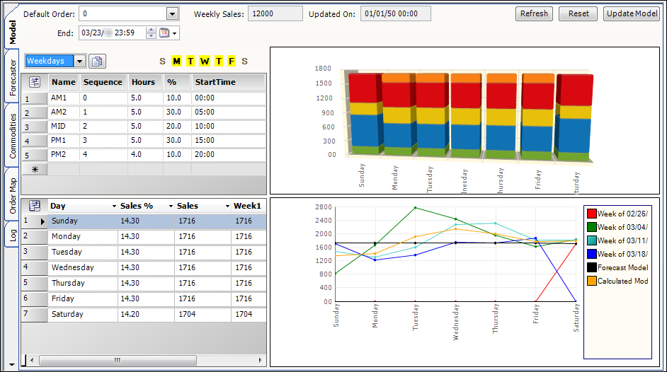
The Commodity Forecast Setup window’s Model tab displays two charts, a column chart and a line chart.
To access the window, select Maintenance > Commodity Forecast Setup.
Viewing the projected sales volume for each day
The Column chart, shown at the top of the tab, displays the projected sales volume for each day definition’s time segments.
Each of these segments represents a number of hours in the day. For each segment, you identify the percentage of the day’s sales that is expected to be made during that segment. The Column chart represents the expected sales for each of the segments. The legend to the right of the chart identifies the colors assigned to the different segments.
The Column chart makes it easy to see which times of the day have the highest product sales.
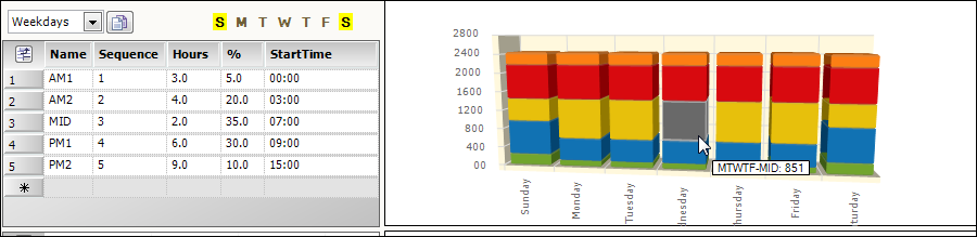
Tool Tips show relevant projected sales details as your pointer moves over a section of a column.
As you make changes to a commodity’s forecast setup, those changes are reflected in the Column chart.
Refer to Recording product sales information for information on changing the weekly sales amount.
Refer to Defining the time segments used to forecast a commodity for information on:
-
Changing the hours allocated to a segment.
-
Changing the percentage of the daily sales attributed to a segment.
-
Adding segments.
To update the chart after making changes, click ![]() Save.
Save.
Viewing the sales by day volume for forecasted weeks
The Line chart displays the percentage of the weekly sales volume projected to be sold each day, for the number of weeks the Forecaster looks ahead.
Each week is represented by a different color line.
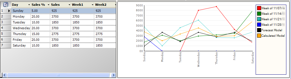
The Forecast Model line represents the data the Forecaster is currently using. If you make changes to the the weekly sales amount, time segments, or sales percentages attributed to time segments or days of the week, the Calculated Model line represents how your changes would change the Forecast Model line if you click ![]() Save.
Save.
Refer to Recording product sales information for information on:
-
Changing the weekly sales amount.
-
Changing the percentage of weekly sales attributed to a day.
To update the chart after making changes, click ![]() Save.
Save.