Format of TMWSuite screens
Each screen in TMWSuite has a specific function and a unique set of fields. However, the organizational layout of most windows is fairly consistent. Understanding of basic screen design characteristics is necessary to:
-
Move quickly from task to task within a specific application
-
Enter data properly in the appropriate windows and fields
A sample screen in Order Entry
The Order Entry screen illustrates the design features common to most TMWSuite screens:
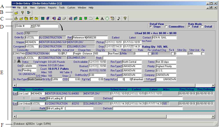
A |
Menus list tasks that are applicable for the screen currently displayed. |
B |
The frame toolbar displays icons used to exit the application or access other primary screens within the application. |
C |
The sheet toolbar displays icons used to initiate tasks, which are applicable for the screen currently displayed. |
D |
The primary screen in an application is usually formatted to look like a file folder. You use the tab area of the folder to specify the ID of the record you want to look up. |
E |
The body of the screen consists of data entry and read only fields. |
F |
The message line displays copyright information; it also displays the name of the database in use, as well as the ID of the user who signed on to the application. When you position the cursor over an icon in a toolbar or over an option in a menu, the message line provides a brief description of the function of that icon or option. |
Folders
Each TMWSuite application contains one or two primary screens on which most information for a record is entered. Each of these primary screens is formatted to look like a file folder.
Each folder has a tab area in the upper left corner. Shown here is the tab for the Order Entry Folder:
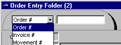
You use the tab to identify the record you want to look up. The tab consists of two fields. The first field allows you to identify the method by which you want to look up a record. When you click in this field, a drop-down list of selections displays, as shown above. After you select a look up option, you must:
-
Enter the record ID in the second field.
-
Press ENTER, or click the Open button, or select File > Open command.
If the ID you entered is valid, the system will display the record it identifies.
Body of a screen
The body of a screen consists of data fields. There are two types of fields:
-
Data entry fields allow you to add or change information on the screen.
-
Read only fields provide information which is available for inquiry purposes, but which cannot be changed. Generally, such fields appear to be "grayed out".
When you first access a TMWSuite screen, the cursor is positioned in the first field in which data can be entered. You use the TAB key to move from one data entry field to the next. On most screens, the tab order is from left to right across a line of fields.
| After you make an entry in a data entry field, there is no need to press ENTER. If your entry is valid, the system automatically accepts it for file update. |
TMWSuite’s security feature allows the TMWSuite system administrator the ability to "hide" fields that are not of use to your company. When fields are hidden, they are not visible to users. The system administrator can also change data entry fields to read only fields for certain users. For details on field level security, see Establishing security for fields and screens in the System Administration online help.
Menus
All screens within TMWSuite allow you to perform a variety of tasks. The screens have pull-down menus that list these tasks. The name of a menu reflects the nature of the options it lists. For example, the Reports menu in the Order Entry Folder provides a selection of reports that can be printed.
Selecting a menu
When you first access a screen within an application, you see a list of available menus displayed across the top of the screen. Note that one letter within each menu name is underlined. To select a particular menu and view its option listing, do either of the following:
-
Depress the ALT key and simultaneously type the underlined letter for the desired menu. The menu’s task listing will display automatically.
-
Use your mouse to position the cursor on the menu name. Then click once with the left mouse button. The menu’s task listing will display.
Once a menu’s task listing is displayed, you can use the LEFT ARROW and RIGHT ARROW keys to move from menu to menu.
Selecting a menu option
When a menu’s task listing is displayed, do one of the following to select an option:
-
Use the DOWN ARROW or UP ARROW key to position the highlight bar on the desired option. Press ENTER.
-
Use the mouse to position the cursor over the desired option. Then click down once on the left mouse button.
-
In most cases, each option has one underlined letter. Type the underlined letter for the desired option.
| If you decide not to select an option from the menu, you can press the ESC key to exit the menu. |
Toolbars and icon buttons
Although pull-down menus list all the tasks that you can perform within an application, you also can initiate many of these tasks by clicking on a button (icon). For example, suppose you want to add a stop to an order in the Order Entry Folder.
You can add a stop to an order by doing either of the following:
-
Select Edit > Add Stop.
-
Click the Add Stop
 icon.
icon.
In most cases when you access a screen within TMWSuite, two sets of buttons display. Each set of buttons is called a toolbar.
There are two types of toolbars:
-
Frame toolbar
A frame toolbar allows you to initiate tasks specific to a particular application. This toolbar always consists of icons that enable you to:-
Open primary screen(s), also called folders, within an application
-
Exit the application
-
-
Sheet toolbar
A sheet toolbar allows you to initiate tasks that are specific to the folder or window currently displayed on screen. For example, a sheet toolbar often contains icons that enable you to:-
Create a new record
-
Open an existing record
-
Add new lines of data
-
Access windows used to enter additional data for a record
-
Save changes
-
Close the record currently in view
-
Determining the position of toolbars on the screen
By default, the frame toolbar displays directly under the pull-down menus. The sheet toolbar displays along the left side of the screen.
If desired, you can change the placement of these toolbars. To do so, follow these steps:
-
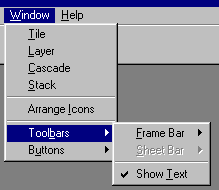
Under the Window menu for any application, highlight the Toolbars command.
-
To indicate the toolbar for which you are making a change, select either Frame Bar or Sheet Bar. When you do so, additional options display
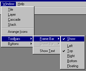
A check mark displays to the left of the option(s) currently in effect (i.e., active).
-
To make a change, select the desired option(s):
Show Text
When active, this option makes the toolbar visible. When inactive, this option causes the toolbar to disappear from view.
Note: When this option is inactive, the five options listed below it are not operational.
Left
When this option is active, the toolbar displays vertically along the left edge of the screen.
Top
When this option is active, the toolbar displays horizontally below the pull-down menus.
Right
When this option is active, the toolbar displays vertically along the right edge of the screen.
Bottom
When this option is active, the toolbar displays horizontally along the bottom of the screen.
Floating
When this option is active, the toolbar displays in the center of the screen.
Note: To reposition the toolbar, use your mouse to position the cursor over the toolbar in an area that does not contain a button. Then click down with the left mouse button and drag the toolbar to the desired spot.
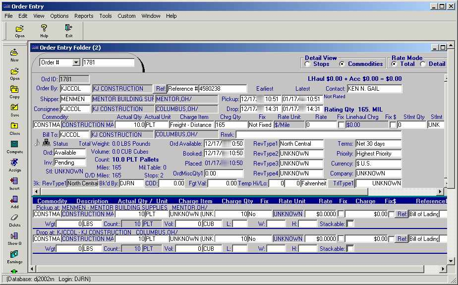
Turning toolbar text on or off
Toolbars can be configured to show descriptive text on each button. This text identifies the button’s function. By default, the buttons on toolbars do not display text. However, when new users are in the process of learning the system, they may prefer to see button descriptions. This illustration shows how buttons look with text:
To turn text on or off, follow these steps:
-
Under the Window menu for any application, highlight the Toolbars command. When you do so, some additional options display to the right, as shown here:
The Show Text option affects both the frame toolbar and the sheet toolbar. When a check mark precedes it, the option is active. This means that descriptive text will display for each button on a toolbar. When unchecked, the option is inactive; no button text will display.
-
Highlight the Show Text command to change it from active to inactive, or vice versa.
| Although it is helpful to have toolbar buttons display with text, there is a drawback. When text is present, the size of each button increases. Due to this size increase, some buttons on the end of a long toolbar may no longer be visible. |
Message line
The message line is located at the bottom of the screen. It displays copyright information; it also displays the name of the database in use, as well as the ID of the user who signed on to the application. When you position the cursor over an icon in a toolbar or over an option in a menu, the message line provides a brief description of the function of that icon or option.