About Trimble Map filters and icons
The Trimble Map integration gives you a lot of information in a small space. This topic reviews the major features of Trimble Maps in TMT Fleet Maintenance.
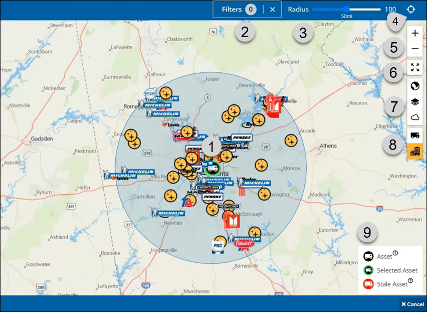
1 |
Your selected unit, as shown by the green circle. The Key reviews what the different unit colors mean. |
2 |
The Filters menu with the number of filters in use. In this illustration, there are 0 filters in use. |
3 |
The Radius control, which lets you set the size of the circled area (radius) from 0 to 100 miles. Here, the radius is set to 50 miles. |
4 |
The Search by Address control, which opens the Search by Address window when you select the cross-hairs icon. |
5 |
The Zoom icons: You can select the plus sign (+) to zoom in or the minus sign (-) to zoom out. |
6 |
The Full Screen icon: Select this icon to expand the view to the full size of your device. |
7 |
The Application icons let you apply functions to the map. See The Application icons for more information. |
8 |
Units and Locations: Just like the Application icons, you can show or hide units and locations by selecting their icons. See The Unit and Location icons for more information. |
9 |
The Key reviews the different ways you can the map displays units. See The map Key for more information. |
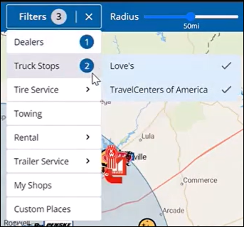
Filters
You can apply filters to reduce the amount of information shown on the map.
-
Select Filters in the upper-right corner of the page. The Filters menu opens.
-
Select the provider types you want to see, such as Dealers, Truck Stops, and Custom Places. Some options let you narrow your selections even further. For example, you can select Truck Stops and then select which truck stops you want to see.
In this illustration, the user selected one dealer and two truck stops from the Filters menu, so the Filters menu shows three filters in use.
The Application icons
Selecting the  Globe icon opens the Map Styles menu, which gives you various controls such as dark mode, light mode, satellite background, terrain, and so on.
Selecting the  Layers icon opens the Content Layers menu, which lets you apply layers over the map, such as traffic congestion, traffic incidents, truck restrictions, points of interest, and so on.
Selecting the  Weather Layers menu. You can select the layers you want to see by selecting their toggle switches, such as Doppler Radar, Weather Alerts (US & Can.), and Wind Speeds.
Selecting any of these icons again let you close the menus. The map updates to show the information you selected. The icons also change color from white to gray to let you know they are in use.
| Off | On |
|---|---|
|
|
The Unit and Location icons
Selecting the  Units icon shows any units in the selected viewing area. If you hover over this icon, you’ll see the message "Show/Hide Nearby Vehicles".
Selecting the  Locations icon shows any locations in the selected viewing area. If you hover over this icon, you’ll see the message "Show/Hide Locations". Remember that the locations you see depend on whether you are using any filters.
Selecting these icons again let you close the menus. The map updates to show the information you selected. The icons also change color from white to gold to let you know they are in use.
| Off | On |
|---|---|
|
|
|
|


Vendor locations appear as logos or yellow and black star icons
| Sample location logo | Location icon |
|---|---|
|
|
The map Key
The map Key reviews the different ways you can the map displays units:
-
Asset (unit): The asset has a black background if location is current.
-
Selected Asset: The selected asset has a green circle around it. The background color changes between black and red depending on whether the unit’s location is recent.
-
Stale asset (unit): The asset icon has a red background if the program has not received a GPS location ping from the asset in over an hour.
-
Help: You can hover over the
 Help icon to see more information.
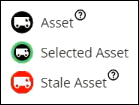
You can select any asset icon on the map to see information such as the unit name, its location coordinates, and the last ping date and time.