Custom Screen Design Mode
Screen Design Mode, accessible from several programs, is a powerful tool that allows you to customize the appearance of TruckMate applications to suit your company’s specific needs. When working in Screen Design mode, you have absolute control over where you would like specific fields, drop-down menus, program buttons- and nearly every other feature available in an application- to appear, as long as it stays within the program window.
For those programs where the Screen Design mode is available, you can create and save as many different layouts as you like.
This feature is accessed using the Toggle Design Mode option available as a right-click shortcut menu option or under the Tools menu if this feature is supported by this program.
The best way to learn how to use Screen Design mode is to try it and experiment! You can always revert to the factory default layout and appearance at any time.
Screen Design Mode is available in:
|
|
|
|
|
|
|
|
|
|
|
|
|
|
|
|
| If a user with a high monitor resolution creates a Screen Design for a specific application, other users (with lower resolution monitors) will experience display issues, such as forms not fitting the screen properly, etc. |
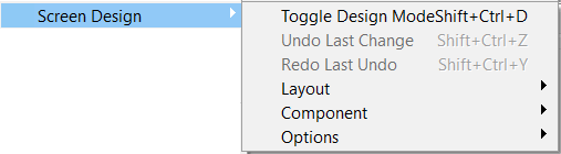
Screen Design menu options
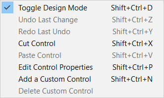
The following menu options are available by selecting Tools > Screen Design > Toggle Design Mode for those programs that offer the Screen Design Mode feature.
| Menu option | Keyboard shortcut | Description |
|---|---|---|
Toggle Design Mode |
SHIFT+CTRL+D |
Enters and exits Screen Design mode in the application you are currently working with. When in Design Mode, hovering your mouse over a screen element (field, button, etc.) will highlight it (with small dashed line boxes around the perimeter of the element). You can click and drag/drop the screen element to a new location on the window. |
Undo Last Change / Redo Last Undo |
SHIFT+CTRL+Z SHIFT+CTRL+Y |
While working in Screen Design mode, you can Undo and Redo recent changes. Once you disengage and leave Screen Design mode (via the Toggle Design Mode option) you will not be able to Undo / Redo your changes. |
The Layout, Component and Options menu items all have sub-menus described below.
Layout sub-menu
The options available in the Layout sub-menu are used to manage Screen Design Layouts once they have been created.
| Menu option | Keyboard shortcut | Description |
|---|---|---|
Load |
SHIFT+CTRL+L |
Select this option to load a saved Screen Design layout by 'Layout ID'. Only those 'Layout IDs' that were saved as 'Public' layouts will be available to all TruckMate Users. Layouts saved as 'Private' will be available only to the User that originally created it. |
Clear |
SHIFT+CTRL+C |
Select this option to clear the loaded Screen Design. The TruckMate application will be returned to its default Layout. |
Edit Properties |
Selecting this option will open the Screen Design Layout window. If the selected Layout ID is of Public nature, you can edit the available details, such as the Layout Description and Share With options.
|
|
Delete |
Select this option to delete Screen Design Layouts by 'Layout ID'. 'Private' Layouts are only available for deletion by the User who originally created them. |
|
Import |
Imports layouts from other databases by selecting their unique .XML file. Once a Layout is chosen for import, the Import Window’s grid will turn yellow to indicate any duplicate 'Layout ID' names. If there are duplicates, the 'Layout ID' and 'Description' values can be manually edited. Once renamed, the record will not be highlighted yellow and can be flagged for import. |
|
Export |
This option allows you to export out individual (or multiple) screen layouts. Exporting creates an .XML file that can later be imported. |
Component sub-menu
The options available in the Component sub-menu are used to work with individual Screen Design Components (i.e., TruckMate fields, drop-down menus, text boxes, etc.).
| Menu option | Keyboard shortcut | Description |
|---|---|---|
Cut / Paste |
SHIFT+CTRL+X SHIFT+CTRL+V |
These options allow you to select a Component, use the 'Cut' command to remove it from its current location, and then use the 'Paste' command to place it in a different section of the program window. Performing a Cut/Paste is similar to dragging/dropping to move a control, but it is more powerful because you can (in most cases), move the control to a different section / parent. For example, a control on a tab can be dragged anywhere on that tab, but to move it to another tab within the same application, requires you to cut and paste it. |
Edit Properties |
SHIFT+CTRL+P |
Selecting a Component and then choosing this option (or right-clicking a Component and selecting this option) will allow you to edit various details regarding the Component’s functioning in TruckMate. See Edit Control Properties. |
Add Custom |
Note: THIS OPTION IS FOR ADVANCED USERS This option allows you to add your own Custom components, such as Group Boxes, DBEdit fields and Tabs. |
|
Delete Custom |
Right-click on the custom component first and then select this option to avoid accidentally deleting the wrong thing. You will then be prompted to Delete the control. |
Options sub-menu
The options available in the Options sub-menu are used to change miscellaneous aspects of the screen design process.
| Menu option | Keyboard shortcut | Description |
|---|---|---|
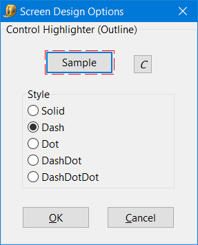
Highlighter |
Opens the Screen Design Options window, where you can change the color and appearance of the highlighting used to identify the selected element while working in Screen Design mode. The Sample button element is used to demonstrate how the highlighting will look based on the options you have selected. Select the C button to choose the color of the highlighting style. |
|
Edit Configs (Only enabled for Customer Service) |
SHIFT+CTRL+O |
Opens the Screen Design Configuration Options window, which allows you to control some of the "hard-coded" <Tab> key jumps in the Customer Service header section. This option is only available when the following conditions are met:
|
Shortcut menu
Once you used the Tools > Screen Design > toggle Design mode function to enter Design Mode a special Design mode right-click shortcut menu will be available. It allows you to right-click any screen design control item and edit it directly.
| Menu option | Keyboard shortcut | Description |
|---|---|---|
Toggle Design Mode |
SHIFT+CTRL+D |
Enters and exits Screen Design mode in the application you are currently working with. |
Undo Last Change / Redo Last Undo |
SHIFT+CTRL+Z SHIFT+CTRL+Y |
While working in Screen Design mode, you can Undo and Redo recent changes. Once you disengage and leave Screen Design mode (via the Toggle Design Mode option) you will not be able to Undo / Redo your changes. |
Cut / Paste |
SHIFT+CTRL+X SHIFT+CTRL+V |
These options allow you to select a Component, use the 'Cut' command to remove it from its current location, and then use the 'Paste' command to place it in a different section of the program window. Performing a Cut/Paste is similar to dragging/dropping to move a control, but it is more powerful because you can (in most cases), move the control to a different section / parent. For example, a control on a tab can be dragged anywhere on that tab, but to move it to another tab within the same application, requires you to cut and paste it. |
Edit Control Properties |
SHIFT+CTRL+P |
Selecting a Component and then choosing this option (or right-clicking a Component and selecting this option) will allow you to edit various details regarding the Component’s functioning in TruckMate. |
Add Custom Control |
SHIFT+CTRL+N |
Note: THIS OPTION IS FOR ADVANCED USERS This option allows you to add your own Custom components, such as Group Boxes, DBEdit fields and Tabs. |
Delete Custom Control |
Right-click on the custom component first and then select this option to avoid accidentally deleting the wrong thing. You will then be prompted to Delete the control. |
Security options
Some security options have been added to the Security Configuration program for use with Screen Design mode. See Security Configuration program > Security > Business Events > Screen Design section for more information.
Screen Design limitations
Customer Service
The Customer Service program includes several Tabs that differ from the majority of TruckMate applications in that they cannot be heavily edited within Screen Design. These Tabs are special because they "host" a form that is used in other TruckMate applications, and thus must maintain their integrity. These Tabs are the IP, COD, Acc Chg, Intermodal, CheckList, Supplier and LTL/Routing Tabs.
For all of these cases, you may move fields around within the Tab / form, and you may move the entire tab’s content (groupbox) as a single unit to another Tab. However, you may NOT move an individual control from the hosted Tab/form to another Tab or vice-versa. For example, you may NOT cut the 'Interliner' edit-pick field from the IP tab and paste it to the Summary Tab. Nor may you cut the 'Carrier Agent' edit-pick field from the Summary tab and paste it inside the IP group-box. You may however shrink the IP groupbox down on the IP tab (so it is not client-aligned) and then paste the Summary tab field to the IP tab (outside of the IP groupbox), and so on.
Custom Defined Fields
Users may NOT edit individual Custom Defined edit-pick fields (as added to TruckMate applications from the Codes Maintenance program > Custom Defs Tab). You can move the entire custom def’s box (scrollbox or groupbox) to another tab, but you may not move fields around within the group/scroll box nor may you cut an individual edit-box and paste it into another tab.
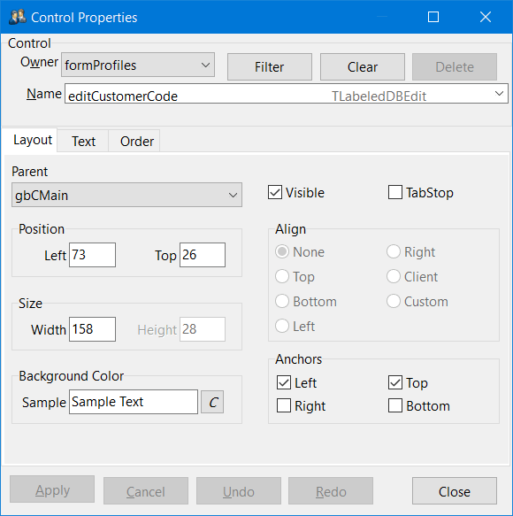
Editing Control Properties
The 'Edit Properties' option on the Component menu allows you to change many different properties of an object or form. You can access the Control window by right-clicking on objects (or forms) and selecting 'Edit Control Properties' or left-click and use the <Ctrl><Shift><P> hot key. For a full list of hot keys for Screen Design, click here.
For example, right-clicking on the grey area in the Customer Service > Summary Tab brings up the Control Properties for the Summary form:
Header and Footer
Owner |
Tells you what main form you are currently working with. |
Name |
Name of the element that you are currently working with. |
Apply |
Select this button to apply any changes you have made to this particular element. |
Cancel |
Select this button to cancel any changes you have made to this particular element, as long as 'Apply' hasn’t yet been selected. |
Undo |
Select this button to undo applied changes. |
Redo |
Select this button to redo the last 'Undo' change. |
Filter Button |
Allows you to filter on Visibility, Class and Parent. |
| You can right-mouse click on any field’s value and use the Restore Original shortcut menu option to restore the original value for that field. |
Layout tab
The Layout Tab offers options that will change the general layout of the selected element.
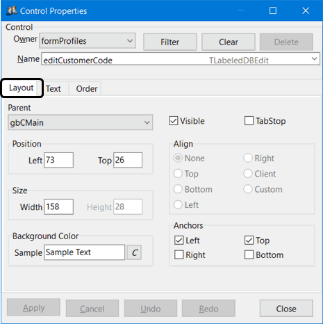
Parent |
This allows you to change the parent form or tabsheet that the object is on (like cut and paste but you need to know the name of where you want to put the object). |
Position / Size |
Some objects like buttons you can change the position and size, this can also be done through click and holding the left mouse button. |
Background Color |
Select the 'C' button to change the background color of the element you are currently working with. Note: Because of Windows themes, you cannot change the background color of TButton controls (standard or custom). |
Visible |
If there is an object you do not wish to appear in the element you are working with, uncheck this flag in order to make it not visible. |
TabStop |
Use the TabStop flag to allow or disallow access to the control using the <Tab> key. If the TabStop flag is checked, the control is in the <Tab> order, and can thus be accessed by a User in its <Tab> sequence. If the TabStop flag is not checked, the control is not in the <Tab> order and users can’t press the <Tab> key to move to the control (it is still accessible via a mouse-click). |
Align / Anchors |
The radio options in these sections are used mostly for when the application is resized. They will control whether the object grows with the changing size of the main application form, and how it’s anchored or aligned. |
Text tab
The Text Tab allows you to change the text label of the element you have selected and some other options.
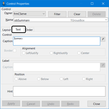
Control - Caption |
This allows you to change the Caption of the button or group box. Select the 'F' button to change specific attributes of the button text (i.e. font, size, color). Note: Because of Windows themes, you cannot change the text color of certain TButton controls (both standard and custom). |
Border |
Fields that have a lot of information in them, such as Address fields, may not display correctly after having their fonts changed. Select the Border checkbox to make a field auto-resize when their font is changed. A warning will display regarding the size issues when you either un-check 'Border' or change the font. |
Alignment |
Controls the text alignment. Only available for some data fields types. |
Label - Caption |
This allows you to change the Caption on Edit pick and other labeled boxes. |
Position |
Controls where the label is displayed relative to the contents of the control field. |
Hint |
This allows you to change the mouse hover hint that users will see if they hold the mouse pointer over this element. |
Order tab
The Order Tab allows you to change the order in which tabbing accesses particular elements in a form or TGroupBox. This is important, for if you make an object invisible (or move it,) you want the tabbing order to be changed to suit what you have designed. You can click any row’s (or control’s) checkbox to toggle among 3 states: checked, unchecked, and greyed. (There are also three buttons above the table, corresponding to these settings, that will apply to all.)
Checked means that the item is visible and TabStop is set to True, and allows normal tabbing. Greyed means that although it is visible, you cannot use the tab key to enter the control; you must click into it using the mouse. Unchecked means the control is not visible (in which case, TabStop is irrelevant).
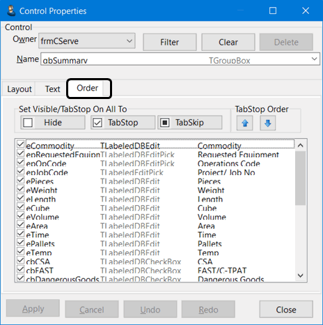
The three large buttons at the top are used to change the settings for every control with one click. The TabStop Order up/down arrows are used to rearrange the tab order.
| Note that TabStop is not applicable for some types of controls (for example, children of a TToolBar, TMainMenu, TPopupMenu, or TMenuItem); for those, the checkbox is either checked (visible) or unchecked (invisible). |
The TabStop Order buttons above and to the right of the grid can be used to move items up or down in TabStop order.
| If the selected control is a PageControl, you can change the order of the Tabs. If the control is a menu (right-click or top menu), you can change the order of the menu items. |
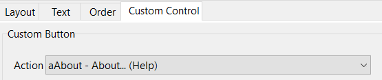
Custom Control tab
There are two variations of the Custom Control tab depending on the type of control being edited.
-
Custom DBEdit for database fields
-
Custom Button for buttons
Custom DBEdit tab
After you choose 'TLabeledDBEdit (read-only database field)' in the Add Custom Control button window, you need to indicate the data to be displayed in the new custom field.
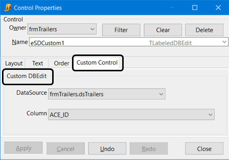
Use the Custom DBEdit Tab in the Properties editor to select:
-
A 'DataSource' (usually tied to a TruckMate Table), and
-
A 'Column' from that DataSource
Custom Button tab
When in screen design, in the option to add or create a custom control, there is a new class/ type option: TButton. This option creates a simple text button (with caption you supply). Initial size is 75x25 pixels, but like any other button, you may change it. The Custom Button Tab allows you to assign an on-click action to the button. The action (or on-click) from all buttons (including toolbar and nav-bar buttons) and all menuitems (including top main menu and right-clicks) are available for assignment to a custom button.
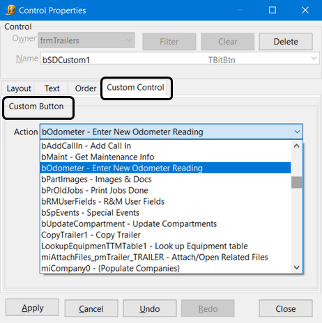
To assign a particular action, look for this item in action drop-down in property editor:
| Existing "action" to duplicate | Find item starting with | Example |
|---|---|---|
Nav button in toolbar at top of form (incl Find) |
'a' |
aNext (scroll to next FB) |
Nav button in navbar in form body (excl Find) |
'nav' |
navTLdtl.aNext (scroll down a line in details grid) |
Other buttons |
'a' or 'b' |
aAbout or btnViewNotes |
Top/right-click menu items |
'a' or 'mi' |
aTMMonitorOnOff or miClearOrigin |
|
Dispatch filters and custom buttons
Any filter created for any section of the Dispatch program is now available for assignment to a custom button via Screen Design. When adding a custom screen design button for a dispatch filter and looking in the action drop-down list in the Custom Button tab of the screen design property editor, look for action names of the form "miFilter_X_N - description" where "miFilter" is fxed, X is a single-letter code for the filter type (e.g. P = power units), N is the unique integer ID for the filter, and description is the name/title you assigned to the filter (e.g. "miFilter_D_17 - Company"). Note that the filter type is helpful in cases where you create multiple filters with the same name (for example, you may have both a driver filter and a power unit filter named "Company").
See Dispatch - Filter Setup section for more information on creating Filters in Dispatch.
Command Center Calls and Custom Buttons
If you have setup a Command Center application call in the Codes Maintenance program, you can assign it to a custom button. Click here for more information. ( Click here links to RoboHelp CHM > Profiles > Codes Maintenance > Command Center Integration > Custom Button Setup)
After you have set up a right-click to call Command Center, you can assign it to a custom Screen Design (SD) button. After you have created the custom button, in SD property editor’s Custom Button Tab look for an entry in the Action drop-down list that starts with 'mikpi_', with the rest of the name being the pop-up’s name plus the call ID from the setup outlined above.
PageControl tab
The PageControl Tab is used to edit the Tab dimensions for the applications that have Screen Design enabled. With this Tab, you can change the height and width of program Tabs, allowing you (for example) to change the default Tab style in the Customer & Vendor Profiles program, so that both icons and text appear on the program Tabs (easing their identification).
| You must right-click the actual tab label and select the Edit Control Properties menu option in order to see the PageControl tab in the Control Properties window. |
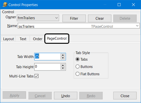
Tab Width |
Set this to '0' to allow the width of each Tab to auto-size, depending on the tab’s caption (the application will make each tab just wide enough to fully show the caption and icon if there is one). Set it to a higher number (of pixels) to force all tabs to be the same size. For the Customer & Vendor Profiles program, before screen design, this is set to 23 (causing the icon to display, but not the text caption). Note: Values between 1 and 19 are not recommended as they are too small to fully display captions. |
Tab Height |
Similar to 'TabWidth', you can set this to '0' to have the application auto-size the tab height (depending on your Windows font size). Note: Values between 1 and 17 are not recommended (too small to fully display captions). |
Multi-Line Tabs |
This is only applicable if the sum of the widths of the individual tabs is greater than the width of the pagecontrol itself (i.e. not enough horizontal space to fully display all the application tabs at once). In this case, there is a trade-off:
|
Tab Style |
This indicates the look of each tab (i.e. how the tabs are drawn). Most TruckMate pagecontrols are set to 'Tabs'. Experiment with this value if you desire- it merely affects the aesthetic appearance of the application tabs. |
Adding a Custom Control
This option on the Component menu allows you to add your own Custom components, such as Group Boxes, DBEdit fields and Tabs.
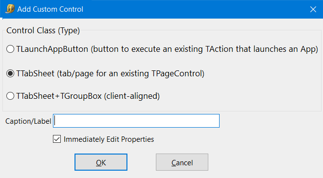
When you click the Add a Custom Control button, the Add Custom Control window will open. Select the type of control you wish to add:
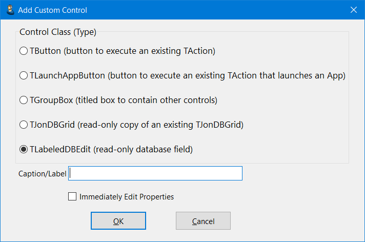
TButton |
Creates a text button (with an editable caption). Initial size is 75x25 pixels, but can be edited. Access the Custom Button tab in the Properties Editor screen to assign an on-click 'Action' to the button. Select from a drop-down list of all actions available in the form.
|
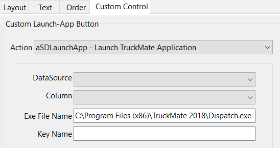
TLaunchAppButton |
Creates a button for launching a specific TruckMate program.
|
TGroupBox |
This creates a box that you can name and then Cut and Paste controls into it or create custom DBEdits in it. When adding a custom Group Box it’s best to start by naming the Group Box and setting the Font if you wish, then sizing the box manually by holding <Ctrl>, selecting it with your mouse, then dragging to the desired size.
|
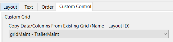
TJonDBGrid |
This component creates a read-only copy of an existing grid, this control is most useful when a user wants to take a glance at a large variety of information. Instead of putting all needed data-entry grids with all their screen-space consuming controls in one custom-designed tab (which makes the tab almost unreadable) use this control to create read-only grids (with no controls) and put them in one custom designed tab, all needed different pieces of information for a specific operation can be put in one tab consisting of several read-only grids to provide the maximum amount of information at one glance when there is a need for it.
|
TLabeledDBEdit |
This is a read-only field from a Database Table intended for displaying information. When adding a DBEdit, it’s best to start with naming the DBEdit and changing the Font if you wish. Next, select the DataSource you want to select a column from. For performance reasons, we do not leave all DataSources open when not on certain Tabs, so some DataSources might not be available when trying to create DBEdits from certain locations. For example, you cannot create DBEdits from the DRIVERPAY DataSource and have them on the main header of the Customer Service program. |
TTabSheet |
This adds a new Tab to the application. When adding a new Tab it’s best to start with naming the DBEdit and changing the Font if you wish. After making a Tab, you should create a Group Box to fill up the TabSheet. Important: When adding the Group Box make sure it’s 'Client' Aligned so that it fills up the whole TabSheet. Now, you can change the Name of the Group box and font if you wish. You can then 'Cut' and 'Paste' onto your new Tab, or create more Group Boxes and DBEdit’s for the Tab. Note: The Mouse must be on an existing tab title header when you select the Add a Custom Control menu option for a special Add Custom Control window containing this option to appear.
|
TTabSheet + TGroupBox |
A quick way of adding both a custom Tab and Group Box. |
Caption/Label |
If required by the Custom Component, you can enter a caption in this field. |
Immediately Edit Properties |
Selecting this flag will auto-open the Control Properties window when a new control is added, so that you can configure and name your control. You are still able to make modifications to your custom controls after the fact, however. |
Changing a Tab Label
Some notes on changing Tab Labels in your TruckMate applications:
-
The font type, size, and style (italics etc.) of the actual Tab label are controlled by the TPageControl variable, not the TTabSheet.
-
The font on the the TTabSheet only controls the font on controls on the body of the tab, not on the tab itself.
-
You cannot change the font color on the tabs of a TPageControl (always black).
-
You cannot control the font of a single Tab-a font change applies to all the tabs equally.
Creating a Custom Toolbar
While the default toolbars that come with TruckMate applications cannot be moved, resized or hidden by screen design, the controls contained on toolbars (mostly toolbar buttons) can now be hidden or shuffled/re-ordered.
To make changes to an application’s toolbar:
-
Go into Screen Design mode (<Ctrl><Shift><D>).
-
Go into the Properties Editor (<Ctrl><Shift><P>).
-
Select a toolbar in the control 'Name' drop-down at top (usually, a form has at most one toolbar and it is usually called tbMain- you can search for all toolbars by clicking 'Filter' and then selecting 'TToolBar' from the 'Class' drop-down, which will set the 'Name' drop-down to only include toolbars).
-
Select the Order Tab. You will see a list of checkboxes, one for each control on the toolbar (in the order they appear- i.e. left-most tool button at top of list, etc.).
-
Un-check the items you don’t want to see and drag/drop the items to re-sort the items in your preferred order.
-
Select 'Apply'. You will see your changes on the main form.
-
Keep making changes (and optionally 'Apply' to see how they look), until you are happy with the toolbar’s appearance.
-
If 'Apply' is still enabled (you haven’t applied all your changes yet), select it.
-
Close the Properties Editor.
-
Save your changes (<Ctrl><Shift><D>).
Creating a Custom Menu Bar
The main menu (at top of main screen, accessed via <Alt> key) cannot be moved, re-sized or hidden by screen design, but the 'menuitems' contained on the Main Menu (displayed across the top) can now be hidden, shuffled and/or re-ordered. The same applies to menuitems within the Main Menu that have sub-menus. To make changes to an application’s main menu (or 'menuitems' within a submenu), follow these steps:
-
Enter into Screen Design mode (<Ctrl><Shift><D>).
-
Open the Property Editor window (<Ctrl><Shift><P>).
-
Select a 'TMainMenu' or 'TMenuItem' in the control 'Name' drop-down at the top of the window (usually, a form has at most one TMainMenu and it is usually called 'mmMain'- you can search for all TMainMenu’s / TMenuItem’s with a submenu by clicking 'Filter' and then choosing 'TMainMenu' or 'TMenuItem' from the 'Class' drop-down menu).
-
Select 'OK' to return to the Property Editor (the drop-down for control 'Name' now only includes the specified type menus).
-
Select the Order Tab. You will see a list of checkboxes, one for each item on the menu (in the order they appear).
-
Un-check the menuitems you don’t want to see and drag/drop items to re-sort the items in your preferred order.
-
Apply your changes and close the Property Editor.
-
Save your changes (<Ctrl><Shift><D>).
| If a nav-menu is hidden pre-Screen Design because it does not make sense in the application (i.e. Dispatch), then, although it will be listed under 'mmMain', you will not be able to make it visible. You also can’t change the visibility of menus whose visibility is controlled by Security Configuration or Application Configurator program options (i.e. screen design and undocking TMenuItem’s). |
Editing Screen Design Configuration Options
The Screen Design Configuration Options window is accessed from the 'Options' menu when a Screen Design has already been applied to the Customer Service program.
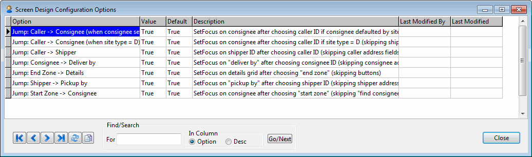
The options on this window will toggle many of the hard-coded <Tab> key "jump" points in the Customer Service program > Header section ('Caller', 'Shipper', 'Consignee' areas, etc.). This is useful if you require a very specific custom <Tab> order in the header area. Because of many other options (application config options and some site options) the cursor may "jump" unnecessarily from section to section of the Customer Service header, so if you’d like a specific <Tab> order, ensure you use this window to toggle all these "jump points" to 'False'.
| The basic best practice to use if you require a custom <Tab> order in the Customer Service header is to toggle all these options to 'False' (i.e. by default tab to the next field) and then use the Edit Properties > Order Tab to configure the <Tab> order you’d like. |
Option |
This column lists all seven of the current hard-coded "jumps" in the Customer Service header. The first two of these options are dependent on setup done on the Codes Maintenance program > Site Codes Tab. |
Value |
Defaulted to 'True' but can be toggled to 'False' in order to turn off the hard-coded <Tab> key jump. Double-click the current value to change the option. |
Last Modified By / Last Modified |
Provides some auditing information so that you can see who last changed the 'Value' column and when. |
Creating a custom screen design layout
| Only users with the appropriate security permissions will have the Screen Design menu option enabled. |
Before you create a new custom screen design layout you should spend some time planning and considering the reasons for and the desired purpose of the screen layout. For example, some reasons may include:
-
Improving data entry efficiency
-
Viewing more data without extra navigation
-
Removing unused fields
-
Securing data
You should also decide if more than one design is necessary and keep in mind:
-
Different groups may need different views
-
There may be screen resolution differences between key users (e.g. mobile users)
-
Auto-resizing may be limited by the screen design
| Creating a mockup of the layout design first to save time later is recommended. |
-
Go to the desired Truckmate progarm window and select the Tools > Screen Design > Toggle Design Mode menu option.
-
While in Screen Design Mode, click any control to see the highlighting used to identify the selected element.
-
Make the changes. For example, you can:
-
drag the selected control to a new location on the window
-
change the height, width, label, font, color characteristics, alignment etc. for any control element using settings available on the right-click shortcut menu Edit Control Properties > Layout and Text tabs
-
hide a control by using Edit Control Properties > Layout tab and setting the Visible checkbox
-
delete a control
-
create and add your own buttons, fields and grids using the Add a Custom Control function
-
-
Select Toggle Screen Design to exit Screen Design mode and save your changes.
-
Click Yes in the Save Changes confirmation message box.
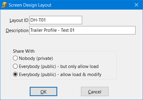
-
The Screen Design Layout window is displayed.
-
There are no limits on the number of screen design layouts you are allowed to create.
Layout ID
Enter a Layout ID to save a custom screen layout design. This ID will be used to load this specific design (via the Layout > Load option).
This ID will also appear at the bottom-left of the main form of a TruckMate program when you are working in Screen Design mode.
If you have full access to Screen Design via Security Setup program, and you want to save a layout ID using a name that is already being used, you will be forced to provide a different Layout ID.
Description
You can enter an optional description that will be used to further identify the associated Layout ID. This text also appears as a tool tip when the mouse hovers over the Layout ID on the status bar.
Share With
These options allow you to set some usage restrictions on the Screen Design you have just created:
-
Nobody (private): When set to 'Private', a Layout ID can only be Loaded/accessed by the User that created it.
-
Everybody (public) - but only allow load: all TruckMate Users will be able to Load this Screen Design, but will not be allowed to make changes to it. It will also be available to set as the default for a particular application in the Security Setup program > Security > Allow Changes > Screen Design Tab.
-
Everybody (public) - allow load & modify: all TruckMate Users will be able to Load and/or Modify this Screen Design. It will also be available to set as the default for a particular application in the Security Setup program > Security > Allow Changes > Screen Design Tab.
-
Reverting back to the default screen design layout
Select Tools > Screen Design > Layout > Clear.
| This does not delete any custom screen design layouts you created. They are still available and can be loaded using Tools > Screen Design > Layout > Load. |
Other tools - grid layout and tab undocking
There are other powerful tools you can use to customize the appearance and arrangement of the TruckMate program windows.
Grid Customization gives you the ability to customize the appearance of the data grids by rearranging their order, hiding columns and automatically flagging entries.
The Tab Undocking feature allows you to undock one (or several) of the frequently used application tabs so each undocked tab can be displayed separately from the main form. If you are using multiple monitors or have a high resolution monitor, this feature allows you to view more application data simultaneously.